If you’re on Instagram, you’ve most likely heard of Fat Mum Slim (aka Chantelle). Every month she posts photo prompts (much like my own for “Capture the Little Moments”) called Photo-a-Day (#fmsphotoaday) and it’s gained quite the following. Not only does she encourage me to bust out my camera (or my phone), but I love reading her blog, which covers everything from life as a mom to recipes to photography.
For my “Capture the Little Moments” series, Chantelle so graciously agreed to let me share her post on the Rule of Thirds and how to use it to get great photos. I came across her post and knew I wanted to share it with you because, well, she just explains it so darn perfectly. Have you ever heard of this simple photography trick? It’s one of the first things I learned in photography class and have always carried it with me in the back of my head when shooting.
I’ll let Chantelle explain…
How to create beautiful iPhone photos: the rule of thirds
I’m often asked how I create my iPhone photos, so I thought I’d break it down and give everyone a crash course in iPhone photography. Today I’m talking about the rule of thirds.

What on earth is this ‘rule of thirds’ you speak of?
The rule of thirds is a technique used by photographers to create balance in photos. By using the rule of thirds it’s quite pleasing on the eye and makes the composition more interesting.
Let me simplify it for you. Imagine your photo is broken up into nine little squares {see the image below}. Ideally you want to try to avoid cutting a photo in two by putting the object right in the middle. If I’d moved the building up to sit right smack-bang in the middle of the photo, it wouldn’t be as effective. For the composition to work it’s magic it is best if the focus of the photo {in this case the building} sits at the bottom third {as it does} or at the top third.
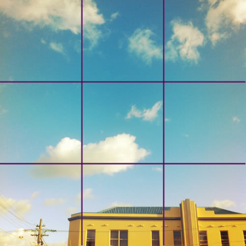
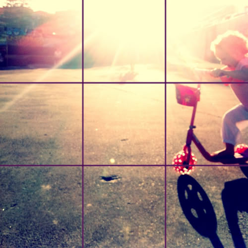
Confused? Don’t be. Here’s another example {below}. See how I’ve put the focus of the photo {in this case Lacey on her scooter} in the very right third of the photo. If I’d put her in the centre it just wouldn’t look as great composition-wise.
Take these two photos I took of the sunset over the weekend. I wanted to show how if I’d put the horizontal line in the photo, which is the skyline, in the middle it wouldn’t be as interesting visually. In the right-hand photo I’ve moved the skyline down into the bottom third and ta-dah, it’s much more pleasing. It works better, don’t you think?

It can be hard to imagine that grid in your photos when you’re taking them, especially when you’ve got a moving subject {ie little people!}. If you’re using an iPhone {and it’s upgraded to iOS 5} then you’ll see the grid on your screen as you take your photos. You can try and put the rule into action as you take your photos. Start by taking pics of things that don’t move – food, skylines, buildings etc for practice.
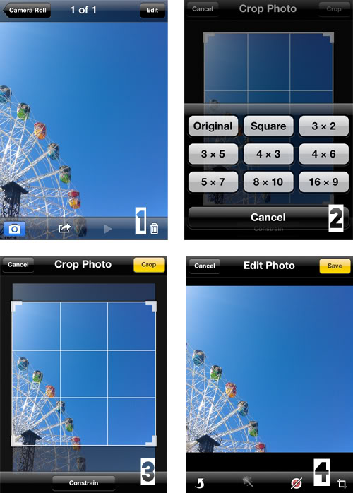
Or if you’re uploading to something like Instagram that requires a square photo, shoot away and edit later. Just select your photo in the camera roll and click edit {in the top right corner}. Click the crop tool and then select square. Move the picture around so it works with the rule of thirds. For my photo I wanted to make sure the top of the ferris wheel hit the first third in the photo. Lastly, click save.
On a final note, this is just a guide. Taking photos and breaking this rule doesn’t mean you’ll end up with a bad photo! Experiment, use this rule sometimes, and sometimes break it. I use this rule a lot when taking my photos as a guide, but a lot of other factors influence my photos too. I’ll talk about those over the next few weeks.
Happy snapping! x
Content & photos used with permission

